It is not the first time we spoke of logos so sure that everyone abundantly clear that this is the presentation of your brand image through which will be easily recognizable.
When we have to design our own, there are many factors we have to consider, such as whether responsive or if it suits the latest trends of the moment.
Typically, its design becomes a turning point in the development of the company we have the best logo in the world and this is done easily recognizable.
However, even perfectly understood the importance of it, I think you have to take some of the weight. Sure logo is important, like the name, but nothing is reversible, and in most cases can (and should) be adapted to get the logo you want. Do not obsess, trends are changing and therefore it is safer to also do your logo.
Finally, when your brand is recognized, the name is not so important. You know perfectly well that is Google, Zara or Mac and need not consider whether or not their names are pretty. Part of your routine and when you name the assimilate directly to a brand.
So today, h softened logos and brands, let’s make a little history and discover some curious facts of those logos that are known to everyone. Logos, perhaps in some cases, are not aesthetically perfect or are not adapted to trends, but have some factor that makes them unique. Sure you give good ideas to represent your brand
We know that there is no perfect logo, but it can be a good time to play with something that makes us unique begin?
If you do not believe me when I say that the aesthetics of the logo is not important, look at Google. In it the maximum simplicity is expressed. The colors that are represented are the primary and we could say that the typography (Catull), although it has some characteristic traits that make it, is not very remarkable.
If we did a year now and we thought of how we could design a logo for Google, a search engine, surely few would approach the actual logo. However, we can not think of a better logo for Google that they have.
This is because its designers wanted to represent the same simplicity, ease transmitting a search engine. We have a serious typography, but is not widely used Times New Roman. We use the main colors, but included a change in the “l” as a sign of rebellion, we do not follow the rules.
In addition, this logo is an example of how without losing its essence has adapted to new trends .
Amazon
Our first thought when looking at the Amazon logo, is that the part orange of the same correspond a smile, but if you look carefully you will see that it is an arrow pointing from “a” to “z” in Amazon can find everything you’re looking for.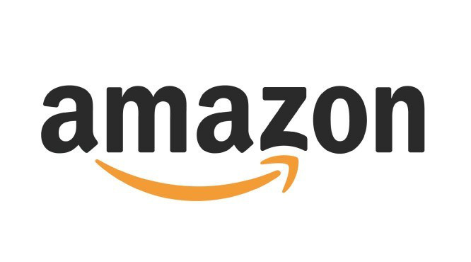
Like Google, it is a very simple logo, but with a clear message. Only the representation of the smile, and inspires in us a sense more, we will leave happy and we can find anything you seek.
The typeface is clear and legible, without serifs or ornaments that could divert our attention.
NBC
He knew the history of this logo and the truth is that I loved. The logo itself, from my point of view is somewhat improved. Not too flat and could be redesigned without any problems.
Flat obsessions aside, if you look good, you will see that the white silhouette depicting a peacock, but more curious logo is not there, but why colors. Well, in the 50s the owner of the chain work with a company that was making color televisions. In this way I wanted to show everyone who even had a TV in black and white what they were missing.
Here you have an animation of the logo, whose traces can leave open the door of the redesign.
Carrefour
Perhaps you have the logo as seen on the posters of these stores, we have not stopped to see a lot hiding inside. Carrefour is a French word that could be translated as “crossroads” or intersection and this is what It occurs in your logo.
If you look properly you can see that between two arrows, one on the right ( blue ) and left ( red ) the “C” Carrefour hides. The C is located at the junction of both directions.
FedEx
Last but not least, I bring one to me, it is one of the best logos ever designed, FedEx logo. We could talk about the combination of colors ( orange and violet ), the most outrageous and shocking, or its typography perfectly marked, but if anything characterizes him is the use of negative.
You may not realize you have become, but between “e” and “x” an arrow symbol representing the traffic and speed, great qualities for a transport company is represented.
The use of negative results was brilliant, if it is a space that already exists because I do not use it to our advantage? We may include added value while we get even a centimeter of the logo is not lost.
Today I have brought these examples, but as you suppose there are many more. Small details that make a logo endure over time and to give character. They are often so subtle that we can see them every day and not know what they conceal and perhaps that is what makes them more special